
I Found a One-Hour Edge in the S&P, Then Three LLMs Made It Better
How I turned a simple idea into a working strategy with basic stats and a little AI magic

A friend of mine owns a Neapolitan-style pizzeria…

When he first opened, he had one recurring headache:
He could never guess how many pizzas he’d sell each night.
Some days he ran out of dough by 9pm.
Other days he overprepared and ended up tossing dozens of unused bases.
But a few months in, something clicked.
He told me he started watching the playground.
The pizzeria is in a shared courtyard with other restaurants and right in the middle, there’s a kids’ play area.
Every evening, about an hour before opening, he’d take a peek.
If the playground was full of kids running around, he’d tell the team:
“Prep more dough.”
If the playground was empty, they’d cut production.
Not perfect.
But shockingly accurate…
“If kids are playing, it means families are sticking around.”
This reminds me of a really cool website I came across years ago that showcased…
spurious correlations…
Things like…
Or even better correlations like…

Crazy right?
But why does it work (apparently)?
Accordingly to Tyler Vigen (the guy behind the spurious correlation website), one of the problems is…
Data dredging
“I have 25,237 variables in my database. I compare all these variables against each other to find ones that randomly match up. That's 636,906,169 correlation calculations!
This is called “data dredging.” Instead of starting with a hypothesis and testing it, I instead tossed a bunch of data in a blender to see what correlations would shake out.
It’s a dangerous way to go about analysis, because any sufficiently large dataset will yield strong correlations completely at random.”
But back to the case of my friend’s pizzeria…
I don’t think it’s a spurious correlation…
And in what I'm about to show you...
I don't think it's spurious either.
It’s called…
The first hour of trading
The Premise
A lot of traders talk about the opening range breakout.
So I got curious…
And I asked myself, what about…
Does what happens in the first 60 minutes say anything useful about how the day might end?
I just wanted to test a simple idea…
If the market goes up in the first 60 minutes…
is it more likely to close green?
That’s it.
No RSI.
No moving averages.
No ML predictive models.
Just clean data, tested with basic statistics.
A tiny hypothesis, nothing more.
But in trading, that’s how it usually starts.
You notice something.
You get curious.
You run the numbers.
And sometimes…
You find something that makes you go:
“Wait. Is that real?”
The Methodology
Here’s how I tested it:
I pulled one-minute data for the S&P 500.
Then, for each trading day, I calculated two things:
The return during the first hour (from 9:30 AM to 10:30 AM)
The return for the full day (from open to close - regular trading sessions)
With that, I split the days into two buckets:
Days where the first hour was positive
Days where the first hour was zero or negative
And then I asked a simple question:
Is there any meaningful difference in how these two groups perform by the end of the day?
No fancy indicators.
No signal smoothing.
No curve fitting.
Just raw market behavior and statistics.
I wasn’t trying to create a strategy.
I was just trying to see if the first hour tells us anything at all.
Turns out...
It might.
What did I find?
Out of all the days where the first hour was positive, a clear pattern emerged.
69.3% of those days ended with the S&P 500 closing higher than it opened.
That’s not an edge (yet), I know, but it’s not random either.
On average, those days produced an intraday return of +0.22%.
Small? Yes, but… (there is always a but)
What about statistical significance?
I ran a non-parametric test (Mann-Whitney U) to compare distributions.
The difference between “first-hour-positive” and “first-hour-negative” days came back with a p-value close to zero. (And btw, I won’t get into p-hacking problems here)
Which, in plain English, means…
The difference is real. Not luck. Not noise. Not a fluke.
To be clear:
Now… before you go all in on this:
Let me be clear.
Statistical edge ≠ trading edge.
But it’s where every good strategy begins.
And this one?
It might just be worth exploring.
Like I said…
It’s not a strategy (yet).
But it’s a starting point.

And sometimes most of the time, that’s all you need.
Before You Get Too Excited
This isn’t a strategy (I’m just repeating myself here for a good reason). Not yet.
It’s a pattern.
And while it looks promising, there are a few things you should keep in mind:
⚠️ The data only goes back a couple of years.
That’s not a lot. We haven’t tested this through a 2008-style crash or a 2015-style grind.
⚠️ It doesn’t exclude macro events like FOMC days or CPI releases, which can completely distort “irrational normal” market behavior.
⚠️ It assumes a clean open and a clean close, no weird fills (but yes, I did consider slippage)
⚠️ And yeah, I know: past performance blah blah no guarantee of future results.
In short:
It’s a pattern (worth exploring), not a promise.
But it’s also how most solid strategies begin.
You notice something small.
You test it.
You refine it.
You make it your own.
This is just step one.

Is That It?
Of course, I didn’t stop there.
I wanted to see a first version of this idea in the form of a strategy…
So I ran a basic backtest.
Same logic:
If the first hour is positive → go long.
Hold until 5 minutes before the close.
No filters. No fancy conditions. Just the raw rule.
I tested it on the S&P 500.
Then I tested it on the Nasdaq, too. (Because if it only works on one index, it might just be noise.)
And when I looked at the performance results, I thought…
Wait... this is kinda dumb…
But it’s also kinda working…

It wasn’t something I’d trade as-is.

But there was definitely something there.
So I pulled even more data, stretching the test 10 years back
And that’s when it got interesting…
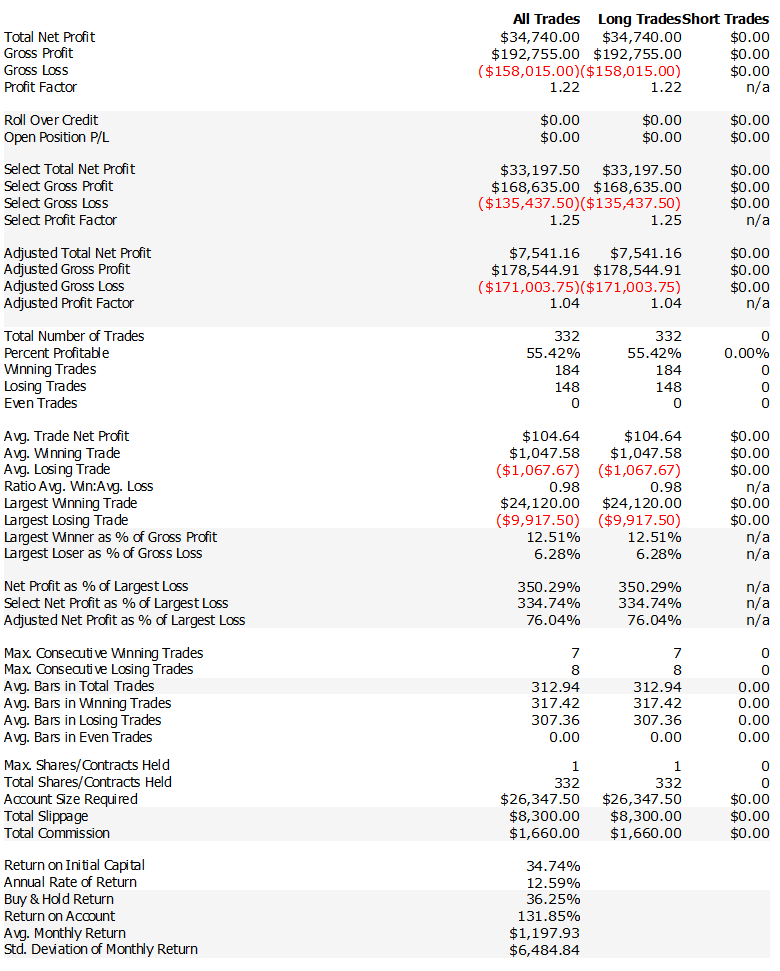
It worked until 2019…
Then you can see the massive, brutal drawdown…
Then around trade #1000 started working again as you can see below…

I looked at the equity curve and thought:
Okay… but maybe there’s something here.
I thought…
What about the chances a market regime filter could make that drawdown disappear without me having to optimize the core strategy at all?
But first I ran the code on the Nasdaq to see the performance and…

It still wasn’t great.
I mean, I hadn’t changed anything yet just applied the raw idea to another market.
But now I was thinking:

“Okay... this I can work with.”
So I called in 3 of the smartest traders I know:

ChatGPT, Claude and Gemini.
And I asked them all the same question:
“What would you do to improve this strategy?”
After a lot of back-and-forth (by the way, if you ever want prompt ideas to talk to LLMs about strategy design, just DM me)...
They gave me some pretty damn good suggestions.
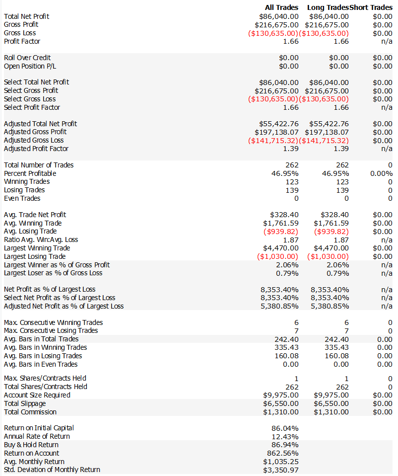
I’ll show you exactly what they came up with, but first, take a look at what happened when I applied just one of their suggestions.
This was the equity curve after the very first filter:

That was already a huge improvement, but the curve still had that one ugly problem:
A massive drawdown of over $40,000.
So I kept going.
After a bit of prompt-wrangling magic, one of the LLMs gave me an idea that led to this version of the strategy:


And this one (Long e Short)…

The logic behind this curve is almost embarrassingly simple.
No neural networks.
No order flow analysis.
No weird indicators with animal names.
Just a tiny tweak…
Suggested by… an LLM (ok, three of LLMs)
I know how that sounds...
But then I ran the backtest.
And I’m not here to argue with equity curves.
(LLMs, on the other hand? I argue with those all the time.)
Here’s what I’ll show you next:
The full rules
The exact logic
The complete code
And the full results with both long only and long/short strategy
Just keep reading…
